by Josée Dupras
I’m Josée Dupras and I’m in environmental studies at the University of Ottawa. As part of my courses, I signed up for a placement to help increase Wild Pollinator Partners’ French presence on its web site. This job included interviewing Edgar René Hernandez, a former student at Ottawa U, who had worked with WPP to create a logo. This young artist, who is very engaged with his community, revealed a great interest in and respect for nature.
Please tell us a bit about yourself, Edgar
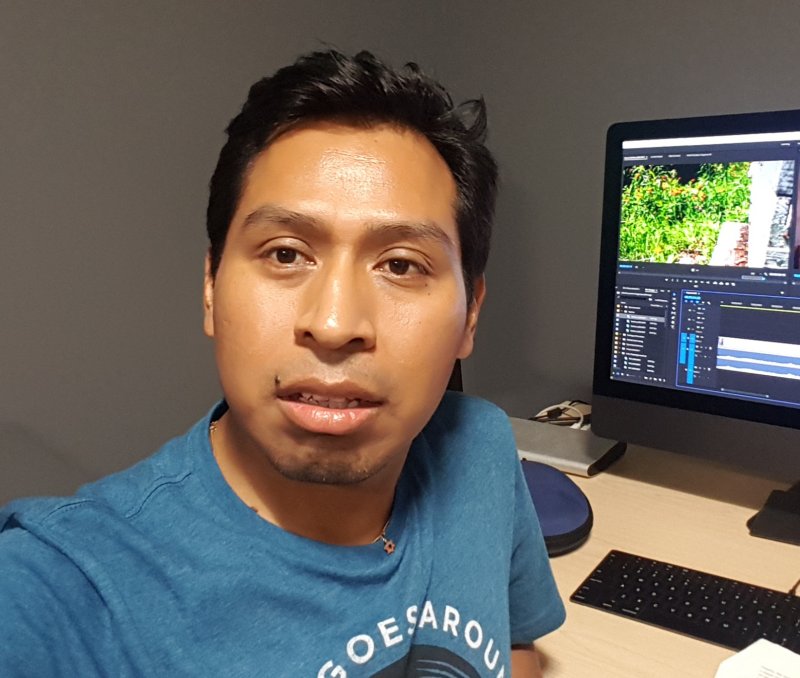
Edgar René Hernandez, at work on a nature video to be screened at the Ottawa Art Gallery
My name is Edgar René Hernandez, I graduated with a bachelor’s degree in Fine Arts with a minor in Spanish from the University of Ottawa.
At a young age, I developed an interest in drawing, and it has always been part of my daily routine. I sketch most of the ideas that come to my spirit on paper. I enjoy the process of drawing, which awakens my creativity, just as someone who would enjoy playing an instrument or a singer who sings from the heart.
I’ve always been curious about nature. Back in 2012, I participated in the photographic herbarium exhibit, a permanent collection at the university’s Faculty of Social Science. Two years later, I was involved in the Learning Garden community, where I met Renate Sander-Regier, who introduced me to the wonderful world of wild pollinators on campus.
What was the thinking behind the logo?
During a pollinator survey in summer 2018, Renate and I were talking about how important the Wild Pollinator Partners (WPP) network is. Students should be involved in such a project. However, WPP needed an image, an identity, to promote the network on campus.
About a week later, I received an email from Renate requesting my help to design a logo. After our first meeting with Sandy Garland at the amazing Fletcher Wildlife Garden, we discussed the new logo concept. We decided to use simple elements such as leaves, wings, plants, and hands. The choice of colour came later in the process. We decided to focus on creating a black and white version of the logo and add colour during phase II. The yellow ochre colour has an earthy touch, and it reminds us of the strong connection of wild pollinators with nature’s path.
Any particular meaning behind the butterfly and the hand?
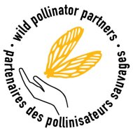 A logo has to communicate before it is understood. People may see a butterfly in the new WPP logo. The wings element portrays the wings of different pollinators, such as bees, butterflies, wasps, bumblebees, and more. Those insects are essential to keep the ecosystem functioning. Wild pollinators play a fundamental role, not only in nature conservation, but also in maintaining our food system.
Another key element is the hand – of researchers, community activists, teachers, residents, and artists, who are interested in helping wild pollinators. The stylized hand represents bringing together people who care and support pollinators.
How was the logo created or drawn?
Phase I was the logo concept development, which included primary sketches and revisions of various concepts. During that process, sketches were drawn on white and parchment paper. It was free-handed using traditional materials, such as graphite pencil, black marker, and super-black India ink with a brush.
Afterward, the selected concept was scanned on the computer in high resolution and imported into Adobe Illustrator. The vector drawings were then merged with a sans serif type face and the yellow ochre colour.
Phase II was development of the colour concept, which included colour options and revisions of the design. The colour was chosen from the 4-colour Pantone matching system swatch book. Phase III was the submission of the new logo in different formats.
Deprecated: File Theme without comments.php is deprecated since version 3.0.0 with no alternative available. Please include a comments.php template in your theme. in /home/wildpol/public_html/wp-includes/functions.php on line 6131